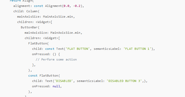
Widget buildFlatButton() {
    return Align(
      alignment: const Alignment(0.0, -0.2),
      child: Column(
        mainAxisSize: MainAxisSize.min,
        children: <Widget>[
          ButtonBar(
            mainAxisSize: MainAxisSize.min,
            children: <Widget>[
              FlatButton(
                child: const Text('FLAT BUTTON', semanticsLabel: 'FLAT BUTTON 1'),
                onPressed: () {
                  // Perform some action
                },
              ),
              const FlatButton(
                child: Text('DISABLED', semanticsLabel: 'DISABLED BUTTON 3',),
                onPressed: null,
              ),
            ],
          ),
          ButtonBar(
            mainAxisSize: MainAxisSize.min,
            children: <Widget>[
              FlatButton.icon(
                icon: const Icon(Icons.add_circle_outline, size: 18.0),
                label: const Text('FLAT BUTTON', semanticsLabel: 'FLAT BUTTON 2'),
                onPressed: () {
                  // Perform some action
                },
              ),
              FlatButton.icon(
                icon: const Icon(Icons.add_circle_outline, size: 18.0),
                label: const Text('DISABLED', semanticsLabel: 'DISABLED BUTTON 4'),
                onPressed: null,
              ),
            ],
          ),
        ],
      ),
    );
  }
  factory FlatButton.icon({
    Key key,
    @required VoidCallback onPressed,
    ValueChanged<bool> onHighlightChanged,
    ButtonTextTheme textTheme,
    Color textColor,
    Color disabledTextColor,
    Color color,
    Color disabledColor,
    Color highlightColor,
    Color splashColor,
    Brightness colorBrightness,
    EdgeInsetsGeometry padding,
    ShapeBorder shape,
    Clip clipBehavior,
    MaterialTapTargetSize materialTapTargetSize,
    @required Widget icon,
    @required Widget label,
  }) = _FlatButtonWithIcon;
 const FlatButton({
    Key key,
    @required VoidCallback onPressed,
    ValueChanged<bool> onHighlightChanged,
    ButtonTextTheme textTheme,
    Color textColor,
    Color disabledTextColor,
    Color color,
    Color disabledColor,
    Color highlightColor,
    Color splashColor,
    Brightness colorBrightness,
    EdgeInsetsGeometry padding,
    ShapeBorder shape,
    Clip clipBehavior = Clip.none,
    MaterialTapTargetSize materialTapTargetSize,
    @required Widget child,
  }) : super(
         key: key,
         onPressed: onPressed,
         onHighlightChanged: onHighlightChanged,
         textTheme: textTheme,
         textColor: textColor,
         disabledTextColor: disabledTextColor,
         color: color,
         disabledColor: disabledColor,
         highlightColor: highlightColor,
         splashColor: splashColor,
         colorBrightness: colorBrightness,
         padding: padding,
         shape: shape,
         clipBehavior: clipBehavior,
         materialTapTargetSize: materialTapTargetSize,
         child: child,
      );
7 of 7 in the series: Fltter移动开发相关
- sqflite操作相关

- TextField多行操作
- 免费作图工具
- Flutter环境更新方法
- 实体类自动生成工具的配置

实体类自动生成工具的配置
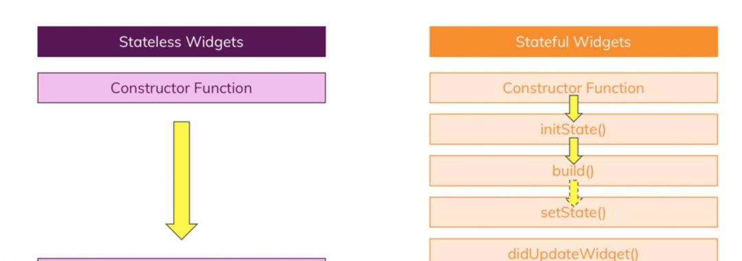
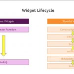
- 理解Flutter widget的生命周期
- 按钮扁平化用法示例-buildFlatButton
按钮扁平化用法示例-buildFlatButton